MeetMe
A Meeting Scheduler
Objective
MeetMe is a meeting scheduling tool that uses automation and already known information to enhance the experience of scheduling meetings.
My Team
UX Designers
Product owner
Engineers
QA
My Role
Brainstorming & Wireframing
User Flows
Usability Testing
UX/UI Design
Prototyping
Challenge
Cisco employees have many meetings with their offshore team every month. However, time difference has always been a difficult issue. Between all different time zones and a busy meeting schedule with people from different cities, people find it challenging to travel through people’s availability in Outlook to schedule a meeting. Most employees find it challenging to keep up with their calendar because they get meeting invites all on top of each other sometimes or they have meetings unnecessarily outside of her working hours.
Current meeting scheduler user flow
Competitor Analysis
Doodle
Pros: 3 step process with the option to select day and time. Poll is shown to the invitees to vote on their available dates for the meeting.
Cons: Multiple steps to select the date range. All times are displayed in one time zone only. Polls may take some time to be closed if participants don’t respond right away.
Meekan
Pros: The bots help provide faster customer service, which leads to user satisfaction. Provides both best and alternate options to select from.
Cons: The video room link is shown before scheduling a meeting. Slackbot is not aware of where the meeting scheduler is located, thus it could drag time to schedule a meeting.
UX Ideation - brainstorming
During the research, our team identified the competitor’s product and analyzed how their user flows are designed, evaluated their strategies to determine their strengths and weaknesses.
MeetMe User flow
Our team has came up with MeetMe user flow that will be implemented on Cisco MyCollab application. This was the original direction, however, it evolved in another direction later in the design process.
Early flow and wireframe sketches
During our brainstorming session, we had a team sketching meeting to come up with more ideas. Here is the quick wireframe I came up with during the sketching meeting with three step process.
Our next meeting was to post our low fidelity wireframe and present to the group. We discussed about the pros and cons of each wireframe concepts. Then we were given a number of dot stickers to place stickers next to options presented that we like.
UX Research: Usability Testing case study
Concept 1: An interactive chatbot with a float action button on the landing page
The first concept was designed by team. Three designers including me came up with two design concepts each and this is one of the design that got selected among six designs.
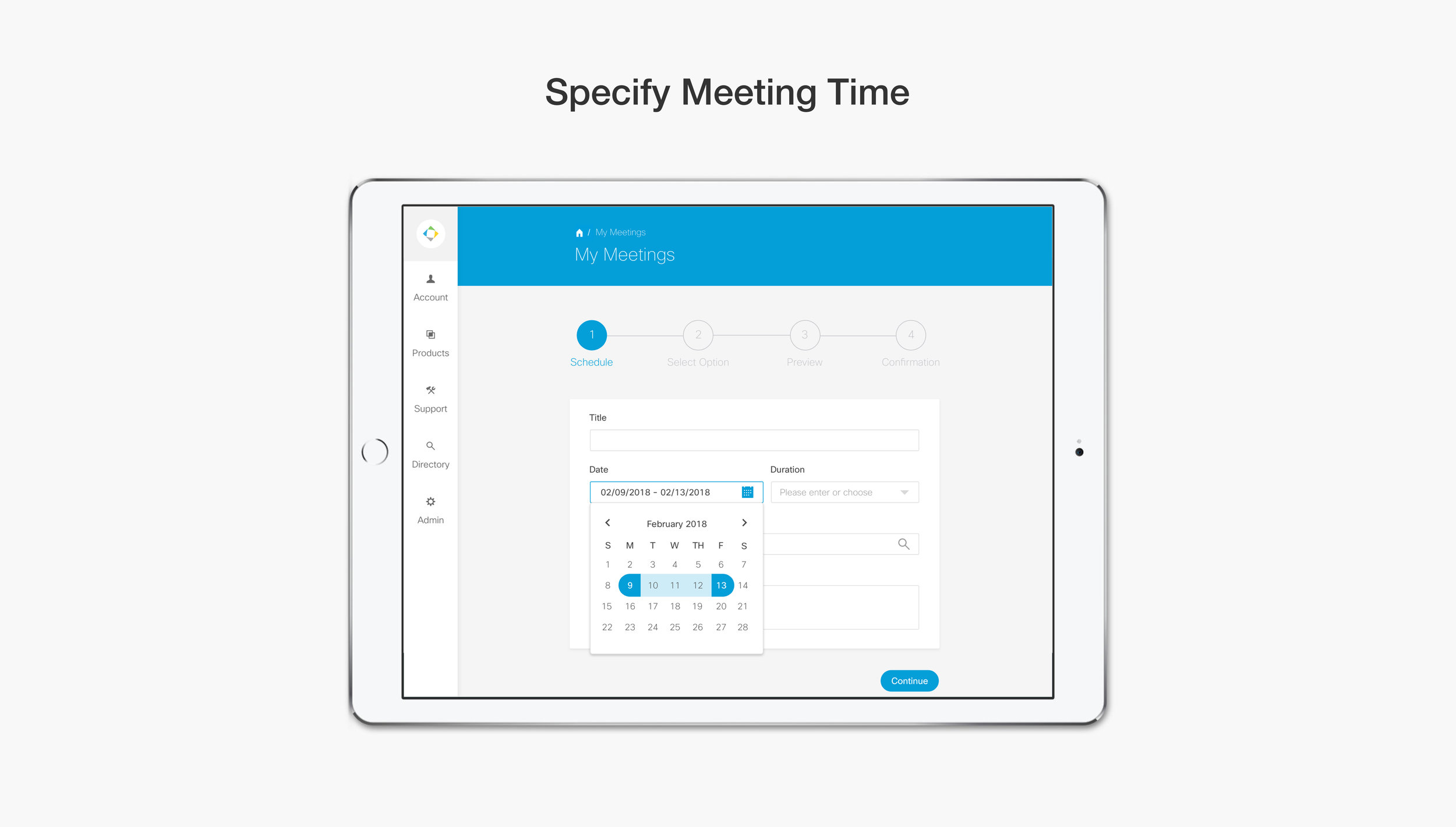
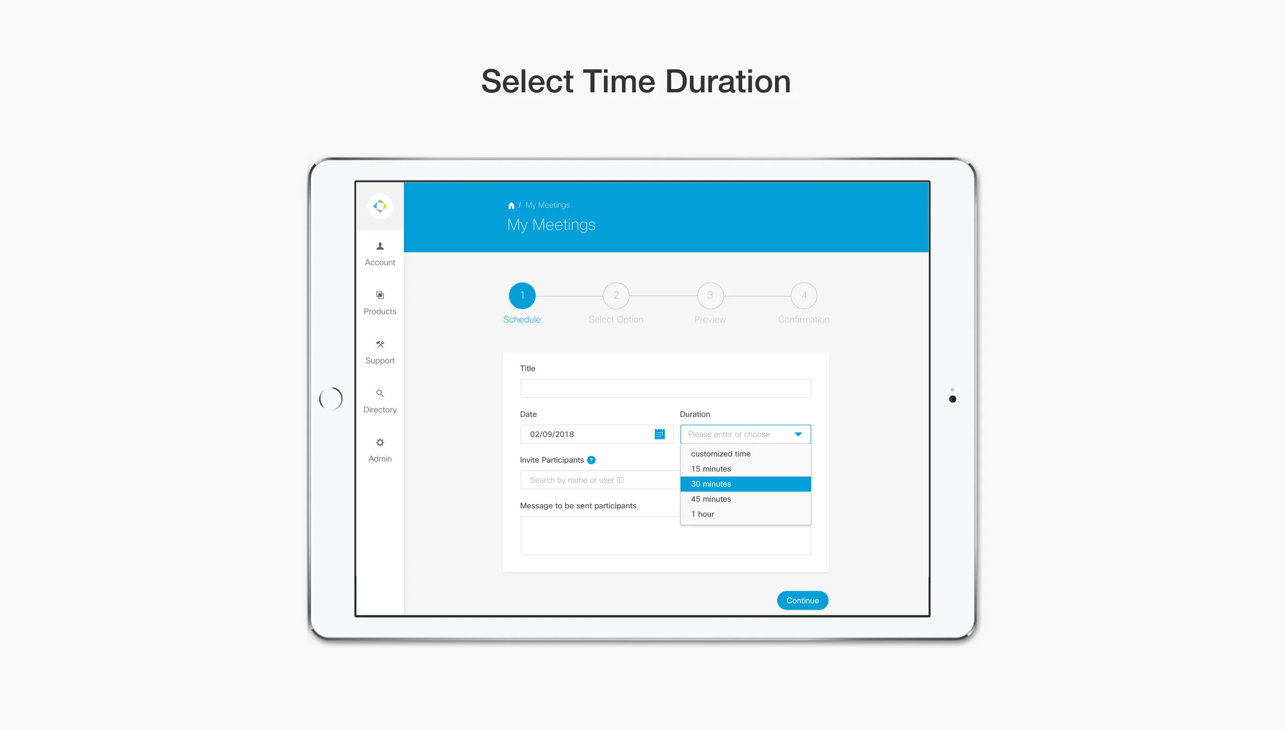
Concept 2: A full page layout accessing from the tab on the navigation bar
This was my design approach that got selected among six designs. This scheduler has 4 step process to book a meeting.
Audience
We randomly selected 8 Cisco employees in building 17. We interviewed 4 men and 4 women. Their roles were analysts, managers, and engineers in Cisco. We conducted. Usability testing by presenting our two designs and asking them 3 questions.
3 Interview Questions
1. Do you prefer a widget or a full page layout?
2. Do you prefer one step or multiple steps when entering meeting details?
3. Should MeetMe be placed on the left navigation bar or a flot action button (FAB) on the bottom right?


